
UI/UX Lessons #1: Designing for Everyone Is Like Pleasing Every Family
I've always enjoyed drawing and designing things.
That said, I quickly realized I don't quite have the artistic talent to become a professional designer.
Watching designers work has given me enormous respect for the profession.
Designing for yourself is fun.
Designing for everyone else?
That's a completely different story.
You can spend an entire night refining a design, proudly present it the next morning... and hear someone say,
"It looks terrible."
Back to the drawing board.
Everyone wants something different
One experience has stayed with me.
I once designed a tiny text button in one of our products.
A teammate immediately said,
"Too much text. Nobody is going to read that."
Fair enough.
I replaced it with a clean, elegant icon.
"A picture is worth a thousand words," right?
A few minutes later another teammate walked by and said,
"Who on earth is supposed to understand that icon? Just use text."
So I added both.
The icon.
And the text.
Then we tested it with users.
Their response?
"Where do I tap?"
"What does this mean?"
"This is confusing."
Moments like these remind me that designing products is a bit like trying to please every family at a wedding.
No matter what you choose, someone will wish you'd done it differently.

Even the biggest companies don't always get it right
Whenever I'm stuck, I often study products from companies like Apple, Google, or Facebook.
After all, they build products used by billions of people.
They employ psychologists, researchers, designers, engineers-even magicians-to better understand human behavior.
Surely they know what they're doing.
Then I ask my mom to use one of their apps.
Suddenly, all my confidence disappears.
My personal benchmark has always been simple:
If my mom and my sister can comfortably use the product, then I'm probably heading in the right direction.
By that standard, Facebook and Messenger didn't do particularly well.
My mom had an account, but every time I tried teaching her how to use it, it became an exhausting experience.
Interestingly, she had no trouble using Zalo.
She could chat, make calls, send photos, and even keep a close eye on her son every single day.
The Bing story
One day I noticed something that genuinely surprised me.
My mom searched the web using Bing.
As the family's "tech person," I immediately switched her default search engine to Google and proudly explained that Google was simply better.
She didn't like it.
She insisted Bing was easier.
After asking why, I finally understood.
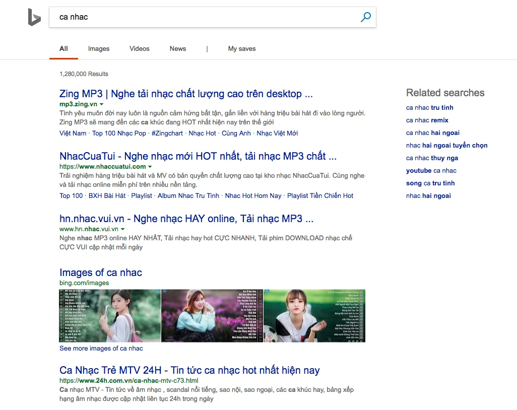
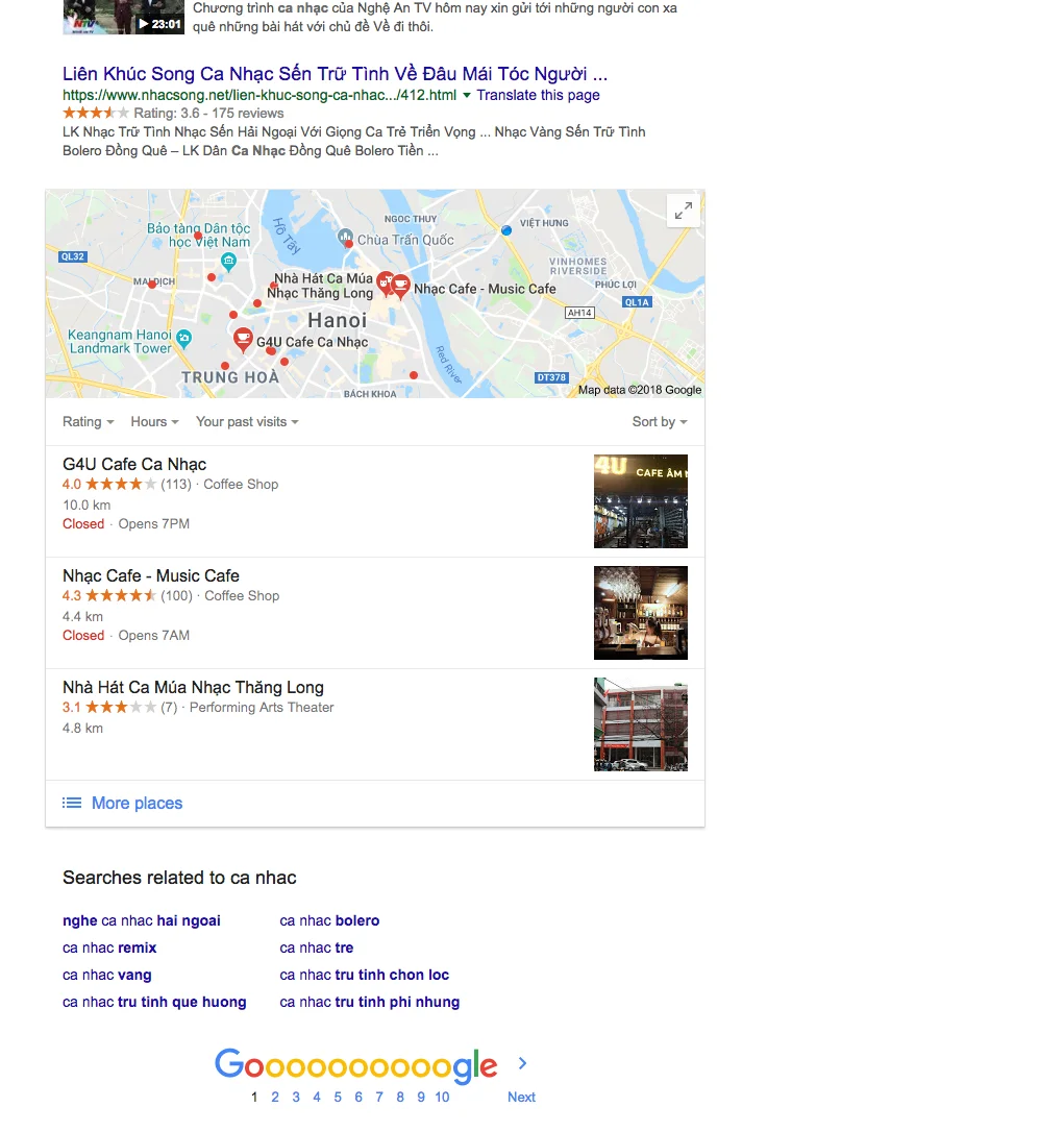
When she searched for something simple like "music", Bing displayed related searches prominently near the top of the page.
She could simply keep tapping suggestions and naturally browse toward what she wanted.
Google also offered related searches-but placed them much farther down the page.
To her, that meant extra scrolling.
Extra effort.
A worse experience.
Eventually I switched her browser back to Bing.
She didn't need to remember websites.
She didn't need Google's sophisticated search algorithms.
She simply needed something that matched the way she thought.
Then there's Uber...
Companies like Uber and Grab invest enormous amounts of money into product design.
Modern interfaces.
Beautiful visuals.
Highly polished interactions.
Yet I've watched plenty of perfectly capable adults struggle to book a ride.
They open the app.
Spend a minute looking around.
Then ask someone nearby for help.
Even I occasionally make mistakes despite using ride-hailing apps constantly.
One design choice I particularly disliked was how promotional codes were hidden away in Uber.
It often felt like the app was saying,
"Here's a discount...
if you can figure out how to use it."
One of the funniest moments was seeing a friend who had previously driven for Uber ask me how to book a ride.
Another memorable example came from Grab's driver application.
The app required drivers to slide to confirm instead of tapping a button.
More than once I watched drivers repeatedly tap the screen, wondering why nothing happened.
Sometimes familiar interaction patterns aren't as universal as designers assume.
Users don't always notice your clever ideas
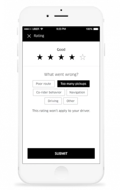
At one point I was designing a rating screen inspired by Uber.
My idea seemed elegant.
If users selected one or two stars, I'd ask for detailed feedback.
If they selected four or five stars, I'd instead invite them to leave a tip.
Context-aware.
Simple.
Smart.
Our product manager suggested something different:
"Just show everything."
I disagreed.
Why make the interface less intelligent?
Then I thought about my own behavior.
I'd taken hundreds of Uber and Grab rides.
Had I ever actually noticed what appeared after choosing a rating?
Not really.
Most of the time I simply tapped a number and pressed Submit without paying attention.
Ironically, I only discovered Uber's interaction because I was trying to recreate it myself.
Sometimes designers become so focused on clever interactions that they forget users aren't studying the interface.
They're simply trying to finish a task.
Every design decision has a reason
Another interesting observation:
Uber intentionally makes its estimated fare less visually prominent than you might expect.
At first glance that seems like poor design.
Later I realized it probably isn't.
If users focus less on price comparisons, they're more likely to choose based on convenience.
In some countries, it also helps satisfy regulatory requirements around fare estimates.
Sometimes what looks like bad UX is actually the result of business, legal, or strategic constraints.
It's easy to assume a design is wrong when we don't know the context behind it.
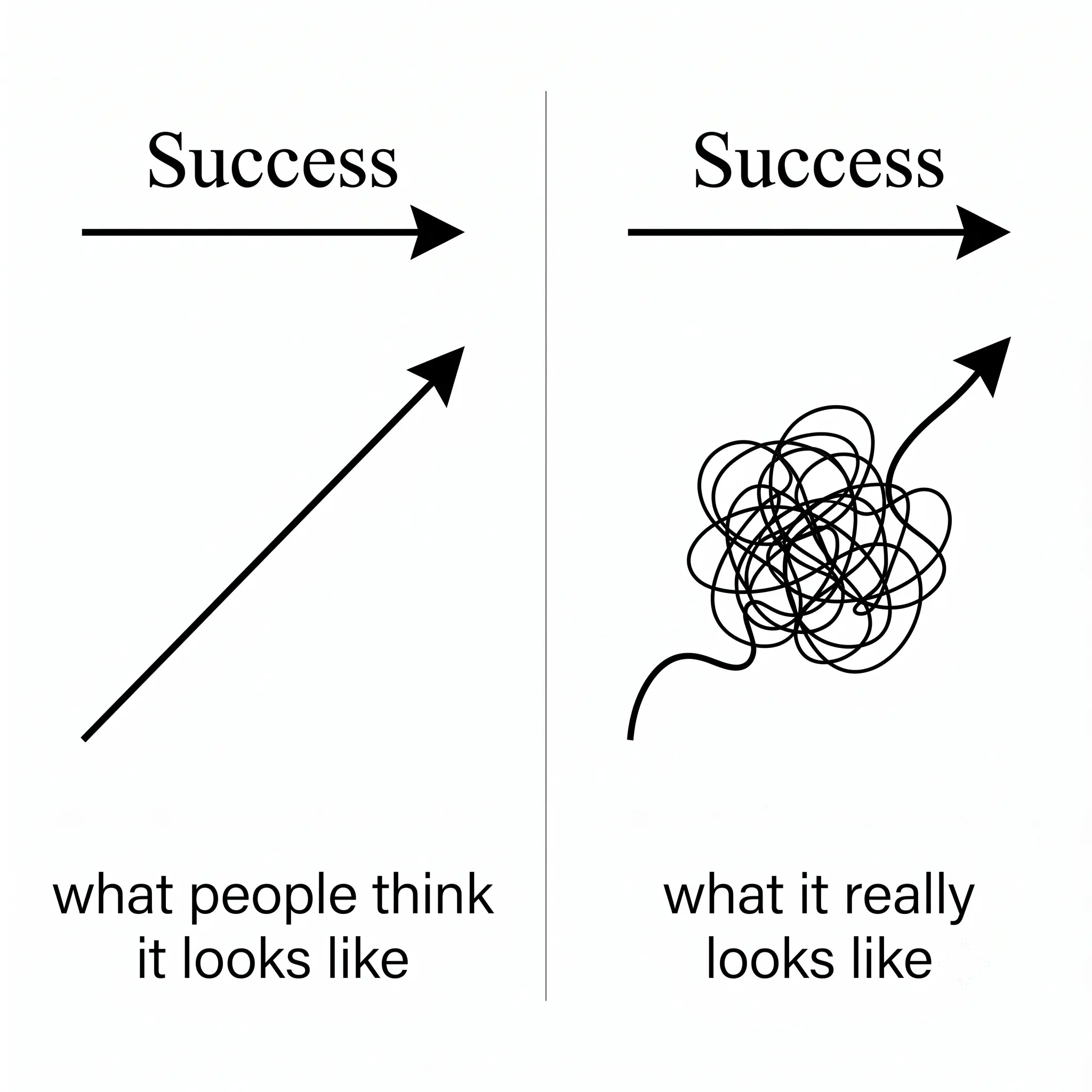
If I designed Uber...
I'd probably create an Uber Simple mode based on one principle:
One primary action per screen.
Something like this:
- Where should we pick you up?
- Where are you going?
- Do you have a promo code?
- Which type of ride would you like?
- Your driver is on the way.
Would that be slower?
Probably.
Would my mom and sister find it easier to use?
Almost certainly.
And that's the challenge of product design.
Creating an interface that works well for everyone is incredibly difficult.
Every user brings different habits, different expectations, different technical skills, and different mental models.
The more people your product serves, the more impossible it becomes to satisfy all of them.
Maybe that's why designing products sometimes feels exactly like trying to please every family at once.