
UI/UX Lessons #3: Carousels in Product Design
"Carousel" is a familiar term in UI design.
Outside of software, it refers to the merry-go-round that children happily ride at amusement parks.
But do users enjoy interface carousels nearly as much?
What is a carousel?
There are many variations-sliders, galleries, swipers, banners-and people often use these terms interchangeably.
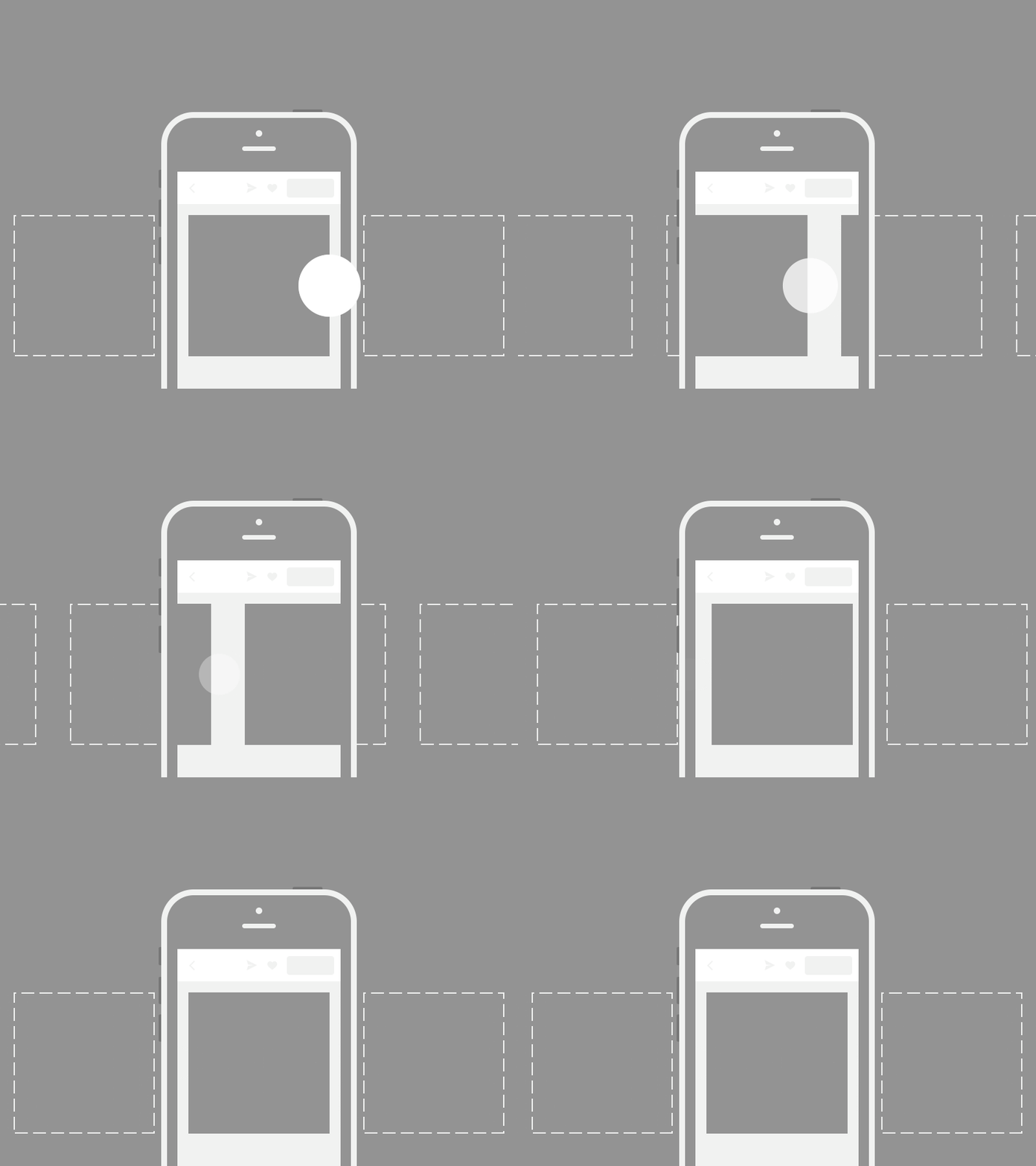
In this article, I'm referring to interfaces like these:

Why designers love carousels
Carousels have two obvious advantages.
First, they let you display a large amount of content-potentially unlimited-within a single area of the screen.
The hope is that users will discover more features, promotions, or announcements without taking up additional layout space.
That's why carousels usually contain large images, important announcements, or featured content, and why they almost always occupy the most prominent position at the top of a page.
Second, they're incredibly convenient for the business.
Marketing teams can update them without changing application code.
Designers can create new artwork whenever they like.
Product managers can promote new campaigns instantly.
Everyone gets their own slide.
I've built countless carousels over the years-for desktop websites, landing pages, mobile websites, and mobile apps.
I was once fascinated by all the fancy open-source carousel libraries with 3D transitions,