
UI/UX Lessons #2: Understanding Optimistic UI
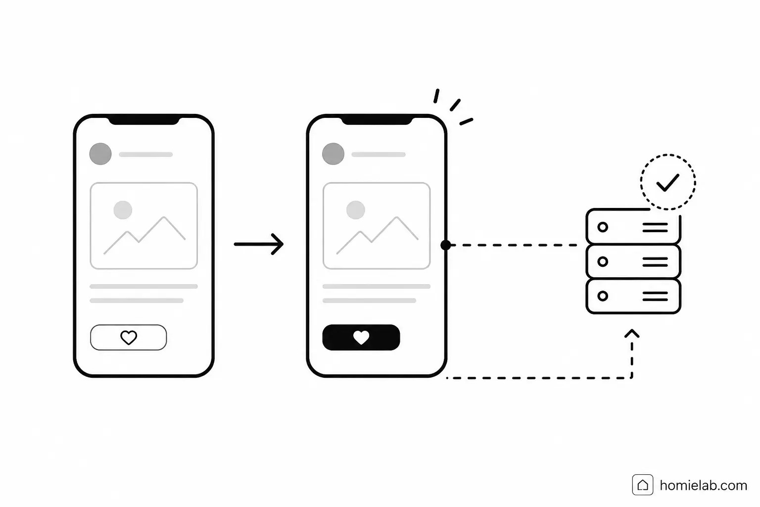
Today I'd like to continue the UI/UX series by introducing a design pattern that every product designer-and especially every developer-should understand:
Optimistic UI.
Although it's considered a user experience technique, I highly recommend that developers learn it as well. It's one of those details that rarely appears in design mockups, yet has a huge impact on how an application feels.
What is Optimistic UI?
Many actions in an application require communicating with a server.
The traditional flow looks something like this:
User performs an action → App sends a request → Wait for the server → Update the interface.
Optimistic UI turns that sequence upside down.
Instead of waiting for the server, the application assumes the action will succeed and updates the interface immediately.
The network request happens afterward in the background.
You've probably experienced this countless times without noticing.
Facebook's Like button.
Instagram's Save button.
Sending messages in iMessage or Messenger.
Moving cards in Trello.
Google Docs' auto-save.
These products all use optimistic updates in subtle ways that make the experience feel effortless.
Why use Optimistic UI?
It's a surprisingly small implementation detail that can make an application feel dramatically better.
Benefits include:
- The app feels significantly faster.
- Users don't have to wait for background operations before continuing with other tasks.
- The interface becomes cleaner because many unnecessary loading states disappear.
I've also noticed that applications filled with loading spinners create a feeling of constant interruption.
Whenever possible, it's worth finding a more elegant way to communicate progress without forcing users to stop what they're were doing.
A practical example
Example 1: Liking a post
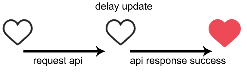
Approach 1 (Traditional)
User taps Like → Send request → Wait for server → Receive response → Handle errors → Show the liked state.
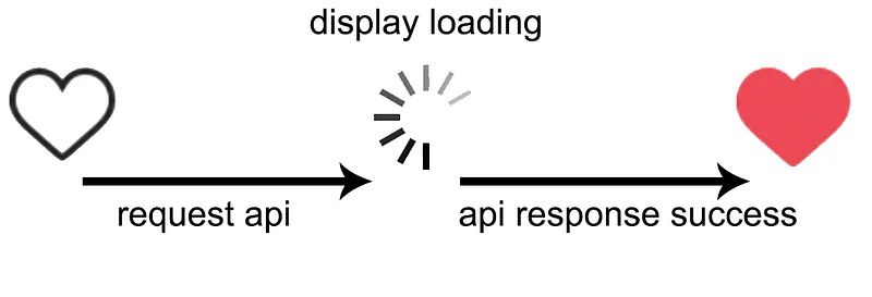
Approach 2 (Loading Indicator)
User taps Like → Show a loading spinner → Send request → Wait for server → Receive response → Handle errors → Show the liked state.
Approach 3 (Optimistic UI)
User taps Like → Immediately show the liked state → Send request → Wait for server → Handle errors if necessary.
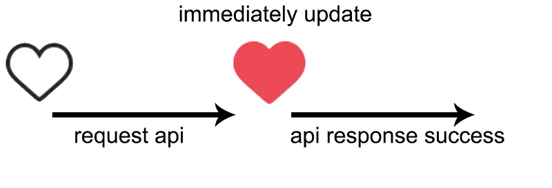
The third approach almost always feels the fastest, even though the network request takes exactly the same amount of time.
Example 2: Sending a message
Here's another classic example.
On the left is the traditional workflow.
On the right is the optimistic approach.
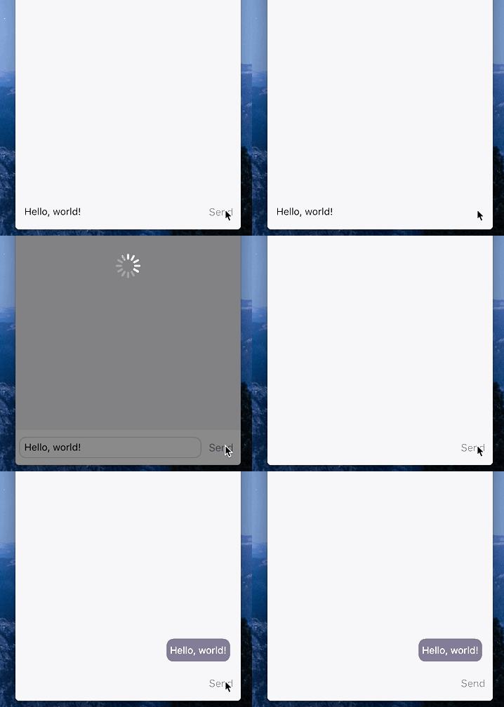
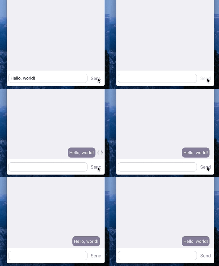
The difference becomes especially obvious on slow networks.
Instead of blocking the user behind a loading indicator, the conversation continues naturally while the message is delivered in the background.
The application feels responsive, even when the network isn't.
One important rule
Always handle failure gracefully
Just because the UI assumes success doesn't mean success is guaranteed.
Requests can fail.
Servers can reject updates.
Connections can disappear.
A good optimistic implementation should be prepared for those situations.
For example:
- Retry automatically one or two times.
- If the request still fails, notify the user.
- Restore the previous state if necessary.
- Offer an easy way to retry.
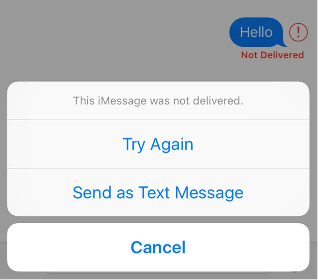
The optimistic update is only half the pattern.
A thoughtful recovery strategy is just as important.
When shouldn't you use Optimistic UI?
Not every interaction is a good candidate.
Some actions require confirmation from the server before the user can safely continue.
Examples include:
- Logging in
- Processing payments
- Changing passwords
- Any operation involving financial transactions, security, or irreversible actions
In these situations, pretending everything succeeded before verification can create confusion-or much worse.
Final thoughts
Optimistic UI is one of those techniques that users rarely notice consciously.
They simply describe the app as fast, smooth, or pleasant to use.
That's usually a sign that you've done it well.
As with every UX decision, there's no universal answer.
Understand your users, understand the risks, and choose the interaction pattern that best fits the situation.
P.S. In the next article, I'll share my thoughts on banners and carousels-and why I'm generally not a fan of them.