IT and the Determination of Blind Users
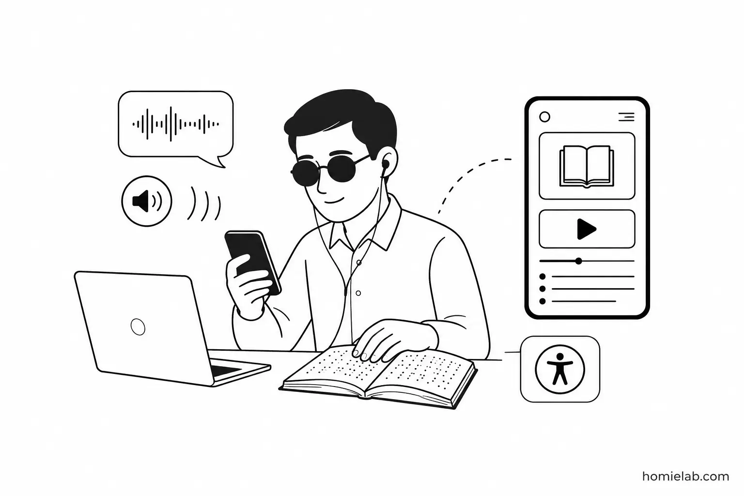
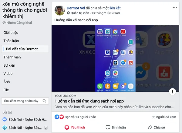
Today I came across a video recorded by a blind user who had filmed, edited, and uploaded a tutorial on how to use SachNoiApp to YouTube.
Honestly, I was amazed.
Not because the video was technically impressive, but because of the determination behind it.
Even without sight-or with very limited vision-they continue exploring technology, learning new things, and sharing knowledge with others.
Many blind users actively use Facebook and YouTube, create content as vloggers, type Vietnamese with remarkable accuracy, and constantly discover the world through audio.
None of that is easy.
In fact, it's many times more challenging than it is for most of us.
Designing an interface for blind and visually impaired users
Many people know about Light Mode and Dark Mode.
Few realize that our audiobook app also includes a dedicated Visually Impaired Mode.
This interface automatically activates whenever the system screen reader is enabled. Modern smartphones already provide powerful screen readers that allow blind and visually impaired users to navigate entirely through speech and gestures.
It's only a small feature, but I hope it can make technology a little more accessible.
If you know someone with vision loss, perhaps this could become another useful source of knowledge and entertainment for them.
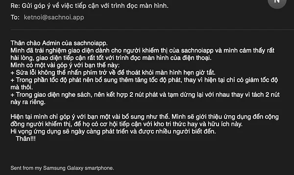
Why build a separate interface instead of reusing the existing one?
The short answer is simple:
They're two completely different ways of interacting with technology.
One relies primarily on vision.
The other relies almost entirely on hearing.
That changes everything.
- Users navigating through audio don't need large images, which also helps reduce mobile data usage. Gestures like swiping, dragging, scrolling, and elaborate animations often become obstacles when using a screen reader. They also consume unnecessary battery power. Advertisements and non-essential features should be minimized. Information should be organized according to the order it's spoken, not how it looks on screen.
- Sighted users, on the other hand, benefit from spacious layouts, strong visual hierarchy, larger images, intuitive icons, and gesture-based navigation that makes efficient use of screen space.
Trying to design one interface that perfectly serves both groups usually results in compromises that satisfy neither.
It reminds me of an old analogy.
Imagine making uniforms for 1,000 factory workers.
Half weigh over 80 kg.
The other half weigh under 60 kg.
If you simply average everyone's measurements and manufacture only one size for 70 kg people, almost nobody will end up with clothes that actually fit.
Accessibility often works the same way.
Some components, however, can and should be shared.
Both web and mobile platforms provide accessibility metadata that many developers simply overlook.
Imagine a button that starts playing music.
For most users, displaying a simple ▶️ icon is enough.
A blind user, however, needs additional information.
You might add an aria-label (or accessibility label) such as:
"Play"
That's already better-but it's still incomplete.
The user hears "Play" without knowing what will be played.
A more helpful aria-hint (or accessibility hint) could say:
"Press to play Lady Gaga's album."
At that point, the words matter more than the visuals.
For accessibility, UX writing often becomes more important than UI design.
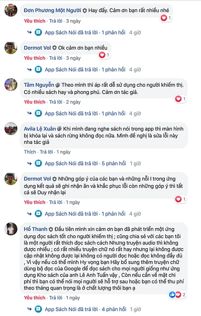
Why do I sometimes say "blind" instead of "visually impaired"?
Some people have asked why I occasionally use the term blind instead of visually impaired. They suggested that visually impaired sounds more polite.
I used to think the same.
But after researching the topic, I realized the two terms are not interchangeable.
Visually impaired generally refers to people who still retain some usable vision, even after medical treatment or corrective lenses.
Blind refers to people with no functional vision at all.
While people sometimes use "visually impaired" as a euphemism for "blind," they describe different conditions.
- Adapted from Wikipedia
I've also heard from members of the blind community that some actually prefer being called blind rather than having others avoid the word.
It was a good reminder that even something as small as terminology deserves careful research.
Assumptions are surprisingly easy to make-and surprisingly easy to get wrong.
Fortunately, when someone points out a mistake, we have the opportunity to learn.
That's far better than never trying and never discovering what we didn't know.
One lesson I've taken away from this experience is this:
Don't judge someone else's design based solely on your own experience.
You don't yet know what they know.
And you probably haven't experienced the challenges they design for every day.